Friday 6 February 2015
Note To Moderator.
I have blogged my journey from start to finish, how other products influenced my creativity and the ways my ideas developed over time. In total I have 101 posts. 44 are research posts, 49 are planning and drafting posts and the remainder are drafts, final copies and answers to the evaluation questions. I have tried to make it clear which were group posts and which were individual. For some tasks we worked together equally.
(Group Post) - Evaluation Question 1.
In what ways does your media product use, develop or challenge forms and conventions of real media productions?
L = Alisha Evans
B = Rebecca Reynolds


(Group Post) - Evaluation Question 2.
How effective is the combination of your main product and ancillary texts?
When
creating our ancillary products we wanted to ensure we had synergy between them
and the music video. To do this we used stills from our video in our ancillary
products. We did this so our target audience would instantly recognise that all
of the products belonged to the same artist (Morgan).
Digipak
The digipak we have created for our
artist contains many similarities with our video:
Our video and digipak feature the same actress (Morgan). She can be seen throughout the video and digipak, therefore our target audience will automatically make connections between the two.
We have a picture page in our digipak which is commonly found in digipaks of this genre (see research). The pictures we have chosen to use are in a mixture of locations and some are stills from the music video, again helping our target audience make connections between them. The photographs we chose to use are mainly performance photographs which are in our video too so again our audience are able to make connections between the two.


The powder paint on the back of the digipak is pastel colours, which contrasts with the front cover but works with all the other photographs because she has a pastel pink dress on. Although the song is about a little black dress we wanted our target audience to see that she isn’t formal all the time. She is also youthful and girly.

Behind where the CD goes we have a red lipstick stain. We chose to do this because she has red lipstick on for the album cover, she is also wearing red lipstick in the video and this is again because we are created synergy between the two.
Album Advert/Tour Advert
The album advert
we have created contains similarities to our digipak and video.

The photograph we have used is the same as on the back of the digipak, creating synergy between the two. We also have a very similar background on it, just slightly toned down. This gives cohesion with our video because it is a still from the powder paint fight.
We used the same font for her name as her name on the album cover. We have chosen white writing with a black outline as Morgan’s logo because it is simple, which is one of the connotations of a little black dress. Although this writing doesn’t look like the writing we have in our video we have chosen it because it looks young and fun, like the video. This is her brand identiy.
For the name of the album on this advert we used a font called ‘Penelope Anne’. We also used this font for the website links on our digipak, and also at the bottom of this advert. This creates synergy with our video because it is the same font as the credits at the end.
Underneath this we have put the album cover, this gives a definite connection between the two for our target audience.
‘The next big pop star’ is writing in a font called ‘KB Sunshine bold’. This is the same font we have on our digipak for our track list. We have chosen the same fonts for our digipak and advert because our audience will recognise them no matter where they are.

For the tour advert we have kept the album cover on it to keep it connected to the digipak. We have also kept the blue writing, but changed the font to ‘Penelope Anne’; this creates a connection to our album advert.
The photograph we have used is the same as on the back of the digipak, creating synergy between the two. We also have a very similar background on it, just slightly toned down. This gives cohesion with our video because it is a still from the powder paint fight.
We used the same font for her name as her name on the album cover. We have chosen white writing with a black outline as Morgan’s logo because it is simple, which is one of the connotations of a little black dress. Although this writing doesn’t look like the writing we have in our video we have chosen it because it looks young and fun, like the video. This is her brand identiy.
For the name of the album on this advert we used a font called ‘Penelope Anne’. We also used this font for the website links on our digipak, and also at the bottom of this advert. This creates synergy with our video because it is the same font as the credits at the end.
Underneath this we have put the album cover, this gives a definite connection between the two for our target audience.
‘The next big pop star’ is writing in a font called ‘KB Sunshine bold’. This is the same font we have on our digipak for our track list. We have chosen the same fonts for our digipak and advert because our audience will recognise them no matter where they are.
For the tour advert we have kept the album cover on it to keep it connected to the digipak. We have also kept the blue writing, but changed the font to ‘Penelope Anne’; this creates a connection to our album advert.
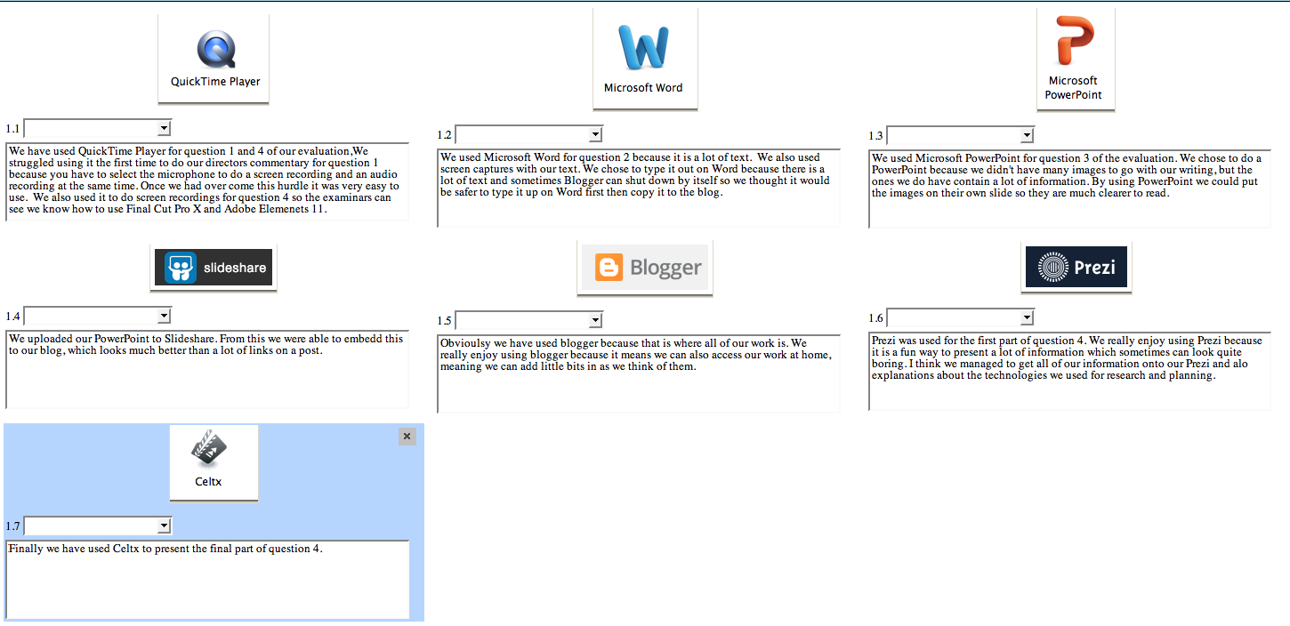
(Group Post) - Evaluation Question 4.
How did you use media technologies in the construction and research, planning and evaluation stages?
This is a screen recording of how we put a vignette on our adverts. We chose to put on a vignette on the advert because we think it draws it all together, it also directs our target audiences attention to the photograph of Morgan which makes her more recognisable.
This is a screen recording of us using the pencil tool to fix her eyes. A lot of the photographs on our digipak are stills from the video, we did this to create synergy. But because of this some of them were not particularly good quality, as we learned in AS the audience are more drawn to something if they have eye contact. So we chose this shot as our album cover but edited her eyes slightly by colour picking the right shade of blue and taking the opacity right down, then doing the same for the black and then the white. Being able to see the white light in her eyes more makes them stand out and will in turn draw our target audience in more.
This screen recording is of us putting a transition on part of our video, we used a few transitions but for our genre we thought that cuts work better. There is a lot of quick beats in the song and it looked better if it was just a sharp cut. We have used transitions during the slower part of the song because it slows the video down to match the pace of the song.
These recordings is are how we cut shots and fixed the colour on them. The first video is how we colour corrected the first shot, but from this (second video) we could just copy and past the attributes of a shot, making all our performance shots the same colours. This was quite a challenge because we had 3 different cameras recording the performance shots and from different angles the lighting was different, it was difficult to get them all looking the same like conventional music videos.
This screen recording was of the most difficult part in our video, making day into night for the party scene. For this we used a 'spot' filter and make it dark and put a lot of contrast on it. If we could reshoot one thing in our video this would be it because it would look better if we filmed it at night, but then you would not be able to see the powder paint as well.
(Group Post) - Final Digipak.
Final Digipak and CD


This is our finished digipak. We have kept with the powder paint theme from the video and used stills from the video to create synergy between the two.
(Group Post) - Final Adverts.
Final Album and Tour Adverts.


These are our two finished adverts. We chose to create an advert advertising her album and digipak and a tour advert for her because it is conventional for artists to have both things advertised at the same time. You can see our progression through making these adverts in our drafts. We chose to add a vignette on the advert because it draws your attention to the centre and to her.
(Group Post) - Merchandise (Clothing).
Tshirts


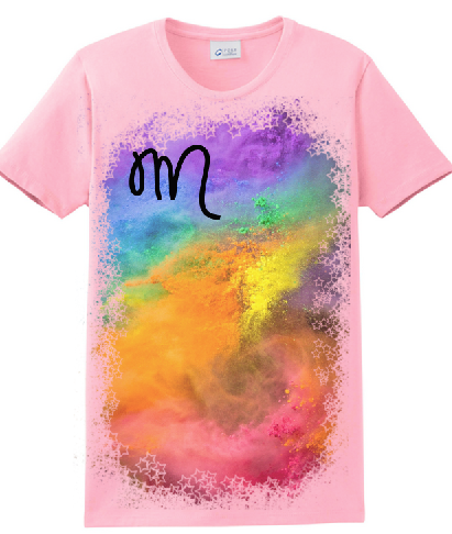


These are two different designs of t-shirt we could include as part of Morgan's promotion package. By giving fans the opportunity to buy clothing with her name on, not only will it produce more money but also make Morgan more well known. Clothing and other merchandising products would be sold on her website. On the designs we have tried to keep the colours and fonts synergetic with the video and digipak.
Video Rough Cut 2.
Rough Cut of Video
This is our second rough cut of our video. We have almost finished it, we have a few shots to change and we would like to put a few more performance shots in to shorten some of the longer shots.
Subscribe to:
Posts (Atom)