Sara Bareilles.

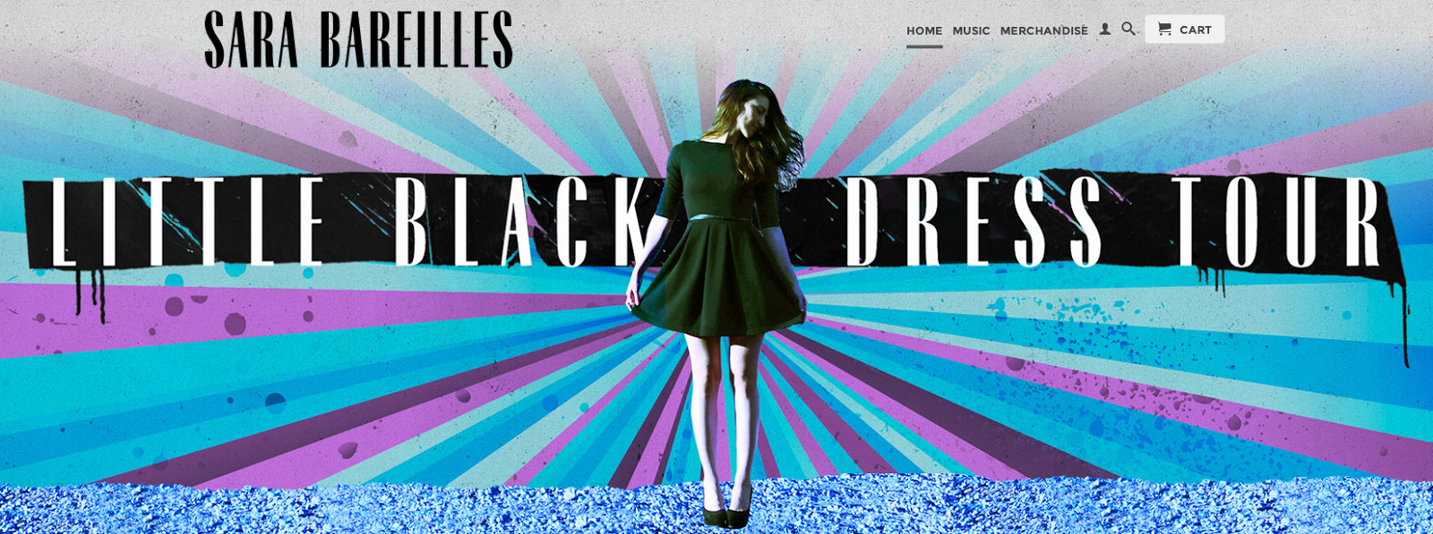
There is a very bright coloured advert for her 'Little Black Dress Tour' which is the first thing you look at on the screen.
 The colours from her tour advert are carried through to her clothing store. The colours are blue and purple which are very harmonious and work together very well. Her picture is slightly tinted green which stands out against the blues, purple and black of the background for the writing. These colours will be recognised as her colours and in theory should be carried on through her merchandise too.
 These are the links on her website for all of her different social networking sites. We could easily create all these different pages for our star too. Her facebook, twitter, instagram and youtube are all below the line marketing because she isn't paying people to run them, she is running them herself.
This is a mixture of all of Bareilles' album covers and single covers. There is a lot of difference between them as she has got older but how her name is written is the same in three and then it changed but is the same in the other three too. All of these album covers could be very easily recreated for our atrist.


Misspelling of artist and avoid slang eg 'gotten'
ReplyDelete